
DORM TO DOORSTEP
Publication Design | Cover Design | Typography | Illustration | Layout
Dorm to Doorstep by Hilary Afshary is a vibrant, advice-filled guide for young women navigating personal growth, relationships, and everyday adulting. Inspired by the idea of something both fun and impactful, like your favorite ice cream sundae with a cherry on top, I designed the full visual experience of the book, bringing her vision to life!
-
Hilary Afshary envisioned a book that felt both approachable and impactful—something that could deliver real-life advice while still feeling light, fun, and visually engaging. The goal was to create a piece that resonated with young women navigating early adulthood, blending guidance on personal growth, relationships, and everyday life into a format that felt inviting rather than overwhelming.
-
The content is thoughtfully organized in layers, inspired by the structure of a favorite ice cream sundae—each section building on the next to create a cohesive and engaging experience.
Glow Up Girl (the ice cream) focuses on personal growth and self-reflection, forming the foundation of the book. Glam Bam, Thank You, Ma’am (the sauce) explores fashion, beauty, and wellness, adding personality and expression. Laced with Grace (the whipped cream) centers on relationships and demeanor, bringing softness and balance. Finally, Gather Round with Goodness (the cherry on top) offers practical tips and tidbits for daily living.
This layered structure allows readers to move fluidly through the content while reinforcing a sense of progression, making the experience feel both digestible and thoughtfully curated.
-
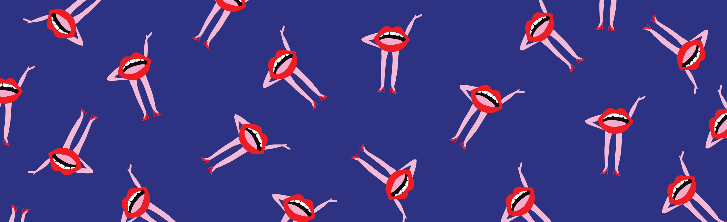
The visual direction was centered around creating something vibrant, feminine, and playful while still feeling polished and intentional. A bold, saturated color palette was paired with fun typography and hand drawn graphic elements on each page to strike a balance between energy and clarity. The overall aesthetic was designed to feel modern, approachable, and uplifting.
-
The cover was designed to immediately communicate the tone of the book—bright, inviting, and confident. Bold typography and graphic elements were used to create strong shelf presence, while the composition ensures clarity and readability across both physical and digital formats.
-
The final product is a cohesive and visually engaging publication that balances personality with clarity, transforming practical advice into an approachable and enjoyable reading experience. In March 2026 the book received a Literary Titan Gold Book Award.